What's new in Monocle 3
Monocle 3 has been re-engineered to analyze large, complex single-cell datasets. The algorithms at the core of Monocle 3 are highly scalable and can handle millions of cells. Monocle 3 will add some powerful new features that enable the analysis of organism- or embryo-scale experiments:
- A better structured workflow to learn developmental trajectories.
- Support for the UMAP algorithm to initialize trajectory inference.
- Support for trajectories with multiple roots.
- Ways to learn trajectories that have loops or points of convergence.
- Algorithms that automatically partition cells to learn disjoint or parallel trajectories using ideas from "approximate graph abstraction".
- A new statistical test for genes that have trajectory-dependent expression.
- A 3D interface to visualize trajectories and gene expression.
Monocle 3 is still under active development. This first early alpha release only includes some of the features listed above. We plan to release updates to Monocle 3 every few weeks that add the functionality you see mentioned here. Moreover, the above is only a partial list of the new features being added to Monocle 3, and more may be announced over the next few weeks and months. Note that some of Monocle 2's functions haven't yet been forward ported to Monocle 3. We welcome users' bug reports, comments and feedback.
The features discussed here will be described in more detail in upcoming manuscripts.
Below, you can find more details about some of the major new ideas and features in Monocle 3.
Uniform Manifold Approximation and Projection
Recently, Leland McInnes and John Healy introduced UMAP, a powerful new manifold learning technique that we've found works extremely well on single-cell RNA-seq data. Monocle 3 uses UMAP to embed cells in a low dimensional space, and then uses our principal graph embedding algorithms to learn a trajectory that fits the cells' UMAP coordinates. This approach enables Monocle 3 to learn very complex, potentially disjoint trajectories without much parameter optimization. Monocle 3 currently relies on the python implementation of UMAP. You can check out the preprint about UMAP here:
McInnes, L, Healy, J, UMAP: Uniform Manifold Approximation and Projection for Dimension Reduction, ArXiv e-prints 1802.03426, 2018).
In Monocle 3 we provide a standard alone function UMAP to run umap. UMAP is also seamlessly integrated into the reduceDimension function.
Installing Monocle 3
Required software
Monocle runs in the R statistical
computing environment. You will need R version 3.5 or higher, Bioconductor
version 3.7, and monocle 2.99.0 or higher to have access to the latest features.
To install Bioconductor:
source("http://bioconductor.org/biocLite.R")
biocLite()
Once you've installed Bioconductor, make sure you've installed Monocle 2 and all
of its required dependencies:
biocLite("monocle")
Install DDRTree (simple-ppt-like branch) from our GitHub repo:
devtools::install_github("cole-trapnell-lab/DDRTree", ref="simple-ppt-like")Install the latest version of L1-graph from our GitHub repo:
devtools::install_github("cole-trapnell-lab/L1-graph")Install several python packages Monocle 3 depends on:
install.packages("reticulate")
library(reticulate)
py_install('umap-learn', pip = T, pip_ignore_installed = T) # Ensure the latest version of UMAP is installed
py_install("louvain")
Then pull the monocle3_alpha branch of the Monocle GitHub repo:
devtools::install_github("cole-trapnell-lab/monocle-release", ref="monocle3_alpha")Testing the installation
To ensure that Monocle was installed correctly, start a new R session and type:
library(monocle)
Getting help
Questions about Monocle 3 should be posted on our Google Group.
Please use monocle.users@gmail.com
for private communications that cannot be addressed by the Monocle user
community. Please do not email technical questions to Monocle contributors
directly.
The Monocle 3 workflow
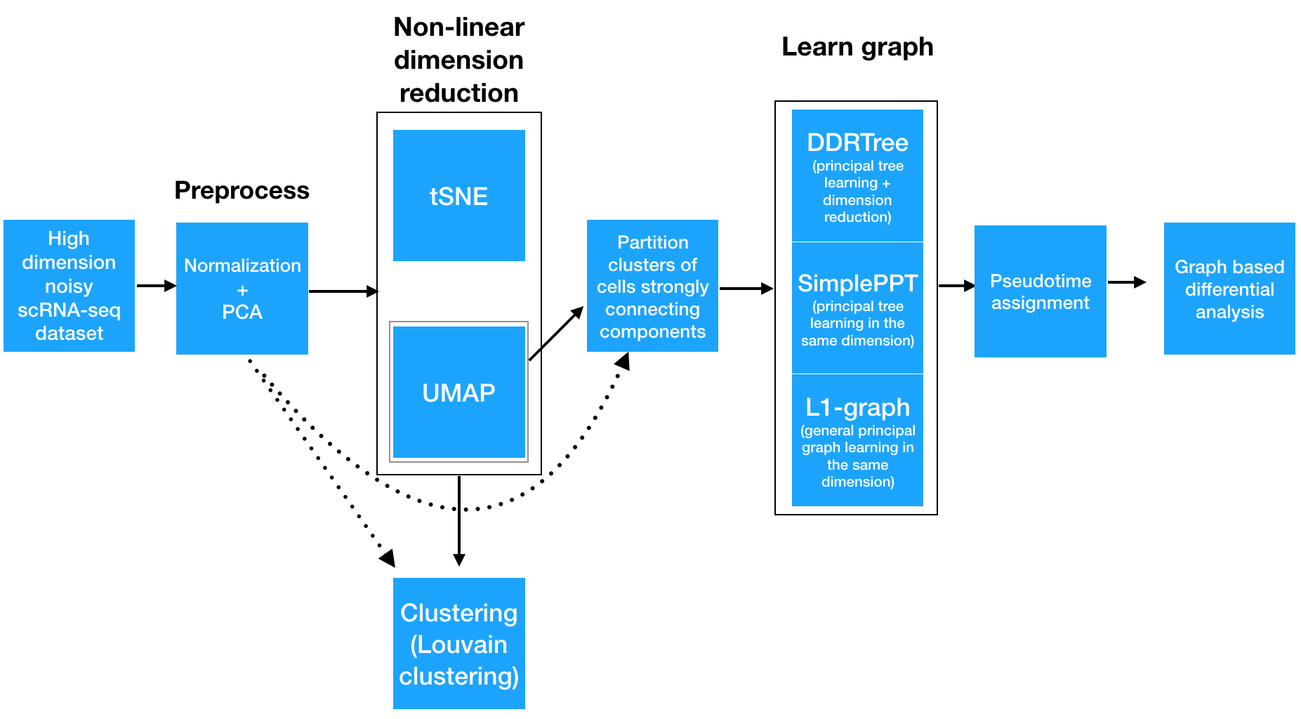
Step 1: Normalizing and pre-processing the data
To analyze a single-cell dataset, Monocle first normalizes expression values to account for technical variation in RNA recovery and sequencing depth.
Step 2: Reducing the dimensionality of the data
Next, to eliminate noise and make downstream computations more tractable, it projects each cell onto the top 50 (by default) principal components. Then, you as the user choose whether to reduce the dimensionality further using one of two non-linear methods for dimensionality reduction: t-SNE or UMAP. The former is an extremely popular and widely accepted technique for visualizing single-cell RNA-seq data. The latter is faster, and often better preserves the global structure of the data but is also newer and therefore less well tested by the single-cell community. Then, Monocle 3 will cluster your cells, organize them into trajectories, or both.
Step 3: Clustering and partitioning the cells
Monocle 3 can learn multiple disconnected or "disjoint" trajectories. This is important because many experiments will capture a community of cells that are responding to a stimulus or undergoing differentiation, with each type of cell responding differently. Because Monocle 2 assumes that all of your data is part of a single trajectory, in order to construct individual trajectories you would have to manually split up each group of related cell types and stages into different sets, and then run the trajectory analysis separately on each group of cells. In contrast, Monocle 3 can detect that some cells are part of a different process than others in the dataset, and can therefore build multiple trajectories in parallel from a single dataset. Monocle 3 achieves this by "partitioning" the cells into "supergroups" using a method derived from "approximate graph abstraction" (AGA) (Wolf et al, 2017). Cells from different supergroups cannot be part of the same trajectory.
Step 4: Learning the principal graph
Monocle 3 provides three different ways to organize cells into trajectories, all of which are based on the concept of "reversed graph embedding". DDRTree is the method used in Monocle 2 to learn tree-like trajectories, and has received some important updates in Monocle 3. In particular, these updates have massively improved the throughout of DDRTree, which can now process millions of cells in minutes. SimplePPT works similarly to DDRTree in that it learns a tree-like trajectory, but it does not attempt to further reduce the dimensionality of the data. L1Graph is an advanced optimization method that can learn trajectories that have loops in them (that is, trajectories that aren't trees).
Once Monocle 3 has learned a principal graph that fits within the data, each cell is projected onto the graph. Then, the user selects one or more positions on the graph that define the starting points of the trajetory. Monocle measures the distance from these start points to each cell, traveling along the graph as it does so. A cell's pseudotime is simply the distance from each cell to the closest starting point on the graph.
Step 5: Differential expression analysis and visualization
Once this is complete, you can run tests for genes that are specific to each cluster, find genes that vary over the course of a trajectory, and plot your data in many different ways. Monocle 3 provides a suite of regression tests to find genes that differ between clusters and over trajectories. Monocle 3 also introduces a new test that uses the principal graph directly and can help find genes that vary in complex ways over a trajectory with loops and more intricate structures.
Tutorial 1: learning trajectories with Monocle 3
In this tutorial, we demonstrate how to use Monocle 3 (alpha release) to resolve multiple disjoint trajectories. We will mainly introduce:
- How to learn tree-like trajectories with monocle 3 in two or three dimensions.
- How to choose the starting point(s) for the trajectory.
- How to visualize these trajectories in static 2D plots and interactive 3D plots.
Preliminaries: Load Monocle and the data
rm(list = ls())  # Clear the environment
options(warn=-1) # Turn off warning message globally
library(monocle) # Load Monocle
Let's load up the data from Paul et. al, which explored hematopoeisis at single-cell resolution. To save time, we'll just load a CellDataSet object. Monocle 3 makes some changes to the CellDataSet class, so we'll call a function to "upgrade" the old object to the new format. If you're starting from an expression matrix and building a new CellDataSet from scratch, you don't need to call updateCDS().
We'll also change the cluster IDs from the original study into easier to read names. Then we'll set up some colors for each of them that we'll use in some plots later.
cds <- readRDS(gzcon(url("http://trapnell-lab.gs.washington.edu/public_share/valid_subset_GSE72857_cds2.RDS")))

# Update the old CDS object to be compatible with Monocle 3
cds <- updateCDS(cds)

pData(cds)$cell_type2 <- plyr::revalue(as.character(pData(cds)$cluster),
                                        c("1" = 'Erythrocyte',
                                        "2" = 'Erythrocyte',
                                        "3" = 'Erythrocyte',
                                        "4" = 'Erythrocyte',
                                        "5" = 'Erythrocyte',
                                        "6" = 'Erythrocyte',
                                        "7" = 'Multipotent progenitors',
                                        "8" = 'Megakaryocytes',
                                        "9" = 'GMP',
                                        "10" = 'GMP',
                                        "11" = 'Dendritic cells',
                                        "12" = 'Basophils',
                                        "13" = 'Basophils',
                                        "14" = 'Monocytes',
                                        "15" = 'Monocytes',
                                        "16" = 'Neutrophils',
                                        "17" = 'Neutrophils',
                                        "18" = 'Eosinophls',
                                        "19" = 'lymphoid'))

cell_type_color <- c("Basophils" = "#E088B8",
                    "Dendritic cells" = "#46C7EF",
                    "Eosinophls" = "#EFAD1E",
                    "Erythrocyte" = "#8CB3DF",
                    "Monocytes" = "#53C0AD",
                    "Multipotent progenitors" = "#4EB859",
                    "GMP" = "#D097C4",
                    "Megakaryocytes" = "#ACC436",
                    "Neutrophils" = "#F5918A",
                    'NA' = '#000080')
Step 1: Noramlize and pre-process the data
We then estimate size factors for each cell and dispersion function for the genes in the cds as usual. Monocle 3 now performs these operations using the DelayedArray packages so they work on datasets with millions of cells. The dispersion calculation and several other operations rely on the DelayedArray package in Bioconductor, which splits the operation into blocks in order to avoid exhausting the computer's memory. You can control the block size and the verbosity of these operations as shown below:
# Pass TRUE if you want to see progress output on some of Monocle 3's operations
DelayedArray:::set_verbose_block_processing(TRUE)

# Passing a higher value will make some computations faster but use more memory. Adjust with caution!
options(DelayedArray.block.size=1000e6)

cds <- estimateSizeFactors(cds)
cds <- estimateDispersions(cds)
Next, run the preprocessCDS() function to project the data onto the top principal components:
cds <- preprocessCDS(cds, num_dim = 20)Step 2: Reduce the dimensionality of the data
Then, apply a further round of (nonlinear) dimensionality reduction using UMAP:
cds <- reduceDimension(cds, reduction_method = 'UMAP')Now we're ready to start learning trajectories!
Step 3: Partition the cells into supergroups
Rather than forcing all cells into a single developmental trajectory, Monocle 3 enables you to learn a set of trajectories that describe the biological process you're studying. For example, if you're looking at a community of immune cells responding to infection, each cell type will respond to antigen (and each other) in a different way, so they should be organized into distinct trajectories. This can also be helpful when you have small groups of outlier cells that for either technical or biological reasons are very dissimilar from the rest of the cells in your experiment. They can confuse a trajectory analysis. Monocle 3's partitioning strategy circumvents this issue because such groups often wind up in their own partition. In the Paul data, there is a small outgroup the authors classified as dendritic cells that Monocle automatically partitions away from the main trajectory.
In Monocle 3, we recognize "disjoint" trajectories by drawing on ideas from Alex Wolf and colleagues, who recently introduced the concept of abstract graph participation. Monocle 3 implements the test for cell community connectedness from Wolf et al via the partitionCells() function, which divides the cells into "supergroups".
cds <- partitionCells(cds)Step 4: Learn the principal graph
Now that the cells are paritioned, we can organize each supergroup into a separate trajectory. The default method for doing this in Monocle 3 is SimplePPT, which assumes that each trajectory is a tree (albeit one that may have multiple roots). Learn these trees with the learnGraph function:
cds <- learnGraph(cds, RGE_method = 'SimplePPT')After you've learned the graph, it's time to assign each cell's pseudotime value with orderCells(). But before we get to that, let's see how to plot the trajectory so we know where the beginning of the trajectory should be.
Step 5: Visualize the trajectory
Once the you've learned the trajectory, you can visualize the it and color the cells in different ways.
plot_cell_trajectory(cds,
                     color_by = "cell_type2") +
                     scale_color_manual(values = cell_type_color)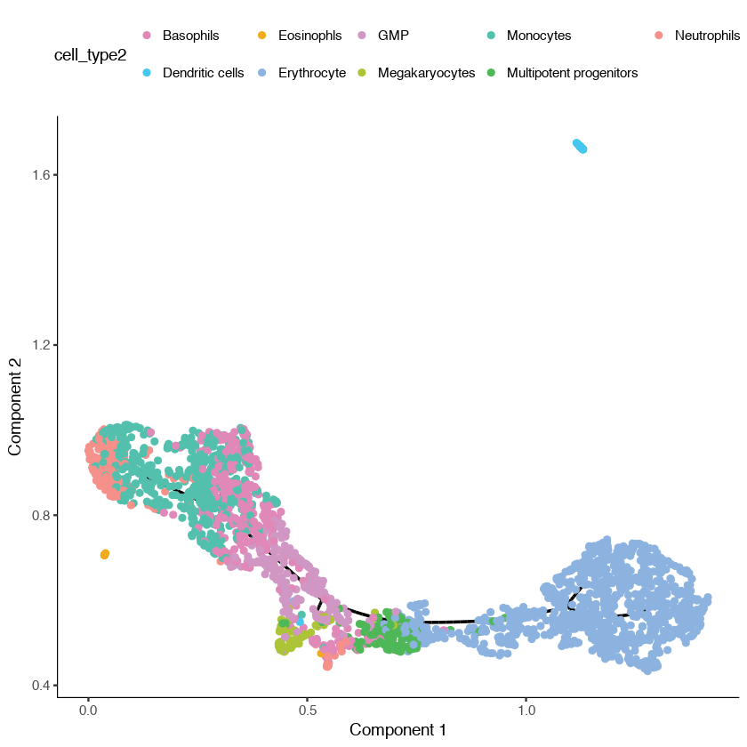
You can see that Monocle has learned two trajectories, one of which is tiny and essentially trivial. The other has one major branch. SimplePPT essentially is finding a principal graph that fits nicely within the cells as projected in the UMAP coordinate space.
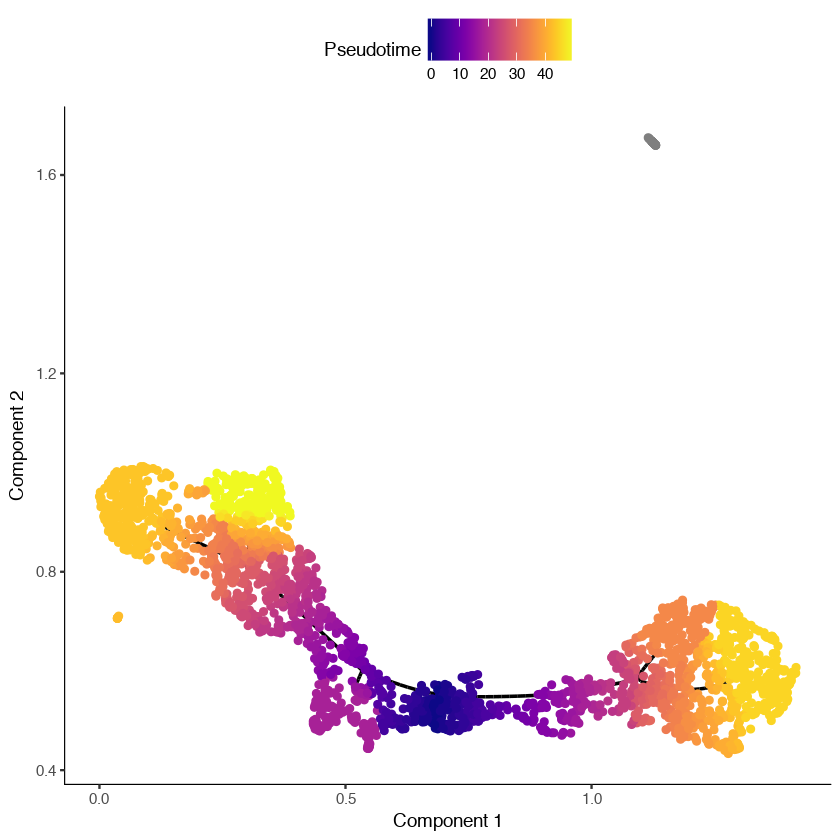
Adjusting the start of pseudotime with orderCells
In the trajectory above, you can see that the "Multipotent progenitor" cells are located roughly in the middle of the longer trajectory segment. We know from extensive past study of hematopoeisis that these are the "root" cell state that generates all the others in the primary trajectory. We need to tell Monocle that these cells are the "beginning" of the trajectory. In Monocle 2, this wouldn't be possible, because the software required that the root be one of the leaves of the tree. Monocle 3 allows you to specify an internal part of the tree as the root. There are two ways to do this:
- You can specifiy the name of a specific cell or principal graph node as the root by passing it to
orderCells(). - You can call
orderCells()with no root specified and it will open a window for you to select the root(s) with your mouse cursor. This latter option is only available in interactive sessions, and doesn't work in Jupyter notebooks.
Once you select one or more roots, orderCells() computes the shortest path from each cell's location on the princiapl graph to the nearest root node. That is, a cell's pseudotime value is the geodesic distance from it to the nearest root, traveling over the graph. Any cell that is not reachable from some root will be assigned a pseudotime value of infinity.
You may find it helpful to automatically pick the root according to any number of biologically-driven criteria. For example, you could find the nodes at which cells expressing a certain marker gene are concentrated. Or we could select the node where cells from an early experimental timepoint land. Here, we provide one such helper function to show you how to do this kind of thing:
# a helper function to identify the root principal points:
get_correct_root_state <- function(cds, cell_phenotype, root_type){
  cell_ids <- which(pData(cds)[, cell_phenotype] == root_type)

  closest_vertex <-
    cds@auxOrderingData[[cds@rge_method]]$pr_graph_cell_proj_closest_vertex
  closest_vertex <- as.matrix(closest_vertex[colnames(cds), ])
  root_pr_nodes <-
    V(cds@minSpanningTree)$name[as.numeric(names
      (which.max(table(closest_vertex[cell_ids,]))))]

  root_pr_nodes
}
In the above function, we are accessing pr_graph_cell_proj_closest_vertex which is just a matrix with a single column that stores for each cell, the ID of the principal graph node it's closest to. This is handy for computing statistics (e.g. with dplyr) about the principal graph nodes and which cells of what type map to them.
Now we can call this function to automatically find the node in the principal graph where our multipotent progenitors reside:
MPP_node_ids = get_correct_root_state(cds,
                                      cell_phenotype =
                                        'cell_type2', "Multipotent progenitors")
cds <- orderCells(cds, root_pr_nodes = MPP_node_ids)
plot_cell_trajectory(cds)
In the figure shown below, we can see that the dendritic cells have a pseudotime value of infinity (shown in gray) because they are not reachable through the graph from the root we selected.
Learning and visualizing trajectories in 3D
Sometimes, projecting cells into three dimensions instead of two can make the biological process you're studying easier to interpret. In Monocle 3, we provide the plot_3d_cell_trajectory function to plot a dataset in 3 dimensions. The block of code below shows you how to learn a trajectory in 3D. Similarly to the 2d case, it:
- Reduces the data down into three dimensions using UMAP
- Learns and the trajectory trajectory and orders the cells
- Visualizes the 3D trajectory
cds <- reduceDimension(cds, max_components = 3,
                       reduction_method = 'UMAP',
                       metric="cosine",
                       verbose = F)

cds <- partitionCells(cds)

cds <- learnGraph(cds,
                  max_components = 3,
                  RGE_method = 'SimplePPT',
                  partition_component = T,
                  verbose = F)

cds <- orderCells(cds,
                  root_pr_nodes =
                    get_correct_root_state(cds,
                                           cell_phenotype = 'cell_type2',
                                           "Multipotent progenitors"))

plot_3d_cell_trajectory(cds,
                        color_by="cell_type2",
                        webGL_filename=
                          paste(getwd(), "/trajectory_3D.html", sep=""),
                        palette=cell_type_color,
                        show_backbone=TRUE,
                        useNULL_GLdev=TRUE)
(You can left-click and drag your mouse to rotate the plot below. Scroll to zoom)
Identifying genes that vary in expression over a trajectory
We are often interested in finding genes that are differentially expressed across a single-cell trajectory. Monocle 3 introduces a new approach for finding such genes that draws on a powerful technique in spatial correlation analysis, the Moran’s I test. Moran’s I is a measure of multi-directional and multi-dimensional spatial autocorrelation. The statistic tells you whether cells at nearby positions on a trajectory will have similar (or dissimilar) expression levels for the gene being tested. Although both Pearson correlation and Moran’s I ranges from -1 to 1, the interpretation of Moran’s I is slightly different: +1 means that nearby cells will have perfectly similar expression (as in the right panel below); 0 represents no correlation (center), and -1 means that neighboring cells will be *anti-correlated* (left).
pr_graph_test <- principalGraphTest(cds, k=3, cores=1)We can easily view the top differentially expressed genes as follows:
dplyr::add_rownames(pr_graph_test) %>%
dplyr::arrange(plyr::desc(morans_test_statistic), plyr::desc(-qval)) %>% head(3)| rowname | status | pval | morans_test_statistic | morans_I | gene_short_name | qval |
|---|---|---|---|---|---|---|
| Gzmb | OK | 0 | 57.31594 | 0.8091045 | Gzmb | 0 |
| H2-Eb1 | OK | 0 | 49.76385 | 0.7394550 | H2-Eb1 | 0 |
| Ermap | OK | 0 | 49.43468 | 0.7485182 | Ermap | 0 |
You can check out the test results for one or more genes like this:
pr_graph_test[fData(cds)$gene_short_name %in% c("Hbb-b1"),]| rowname | status | pval | morans_test_statistic | morans_I | gene_short_name | qval |
|---|---|---|---|---|---|---|
| Hbb-b1 | OK | 8.446106e-179 | 28.48717 | 0.4298683 | Hbb-b1 | 3.131316e-177 |
The code below reports that overall, there are more than 2,300 DE genes over the whole trajectory:
nrow(subset(pr_graph_test, qval < 0.01))Once you've identified differentially expressed genes, you'll often want to visualize their expression levels on the trajectory. The plot bleow shows each cell with detectable levels of Hbb-b1 superimposed on the trajectory. Hbb-b1 is a subunit of beta globin, a highly specific marker of erythroid cells. Indeed, it is largely restricted to the erythroid branch of the trajectory. Values are log-transformed and scaled into Z scores. Cells with no expression are not shown to avoid overplotting.
plot_3d_cell_trajectory(cds, markers = c('Hbb-b1'),
                        webGL_filename=paste(getwd(), "/beta_globin.html", sep=""),
                        show_backbone=TRUE,
                        useNULL_GLdev=TRUE)
Tutorial 2: MCA Dataset Analysis Clustering
Introduction
In this tutorial, we demonstrate how to use Monocle 3 (alpha version) to perform clustering for very large datasets and then identify marker genes specific for each cluster.
We will show how to:
- Use DelayedArray to facilitate calculations in functions
estimateSizeFactor,estimateDispersions, andpreprocessCDSfor large datasets. - Apply
UMAP, a very promising non-linear dimension reduction to learn low dimensional representation of the data. - Run (
principalGraphTest) to identify genes that vary between clusters. - The
find_cluster_markersfunction to identify cluster specific genes. - Visualize these results using new plotting functions
We will use the "Mouse Cell Atlas" (MCA) dataset (Han, Xiaoping, et al. "Mapping the mouse cell atlas by Microwell-seq". Cell 172.5 (2018): 1091-1107.) for this tutorial. You may want to check out another analysis of this dataset with Seurat from Rahul Satija's lab.
Load necessary packages
First, let's load up the packages we'll need in this tutorial.
rm(list = ls()) # clear the environment
#load all the necessary libraries
options(warn=-1) # turn off warning message globally
suppressMessages(library(reticulate))
suppressMessages(library(devtools))
suppressMessages(library(monocle))
suppressMessages(library(flexclust))
suppressMessages(library(mcclust))
Make sure the python package louvain is installed so that we can run louvain clustering with different resolutions (see below).
Please also make sure the newest UMAP 0.30 version is installed.
Please run the following code:
#ensure umap-learn 0.30 is installed
py_install('umap-learn', pip = T, pip_ignore_installed = T)library(reticulate)
import("louvain")Create a cds object for MCA dataset
In the following, we load a preprocessed sprase matrix and cell meta dataframe and then create the cell dataset for downstream analysis. We thank the Seurat development team for providing the processed data.
(https://satijalab.org/seurat/mca.html)!
    MCA <- readRDS(gzcon(url("http://trapnell-lab.gs.washington.edu/public_share/MCA_merged_mat.rds")))
    cell.meta.data <- read.csv(url("http://trapnell-lab.gs.washington.edu/public_share/MCA_All-batch-removed-assignments.csv"), row.names = 1)

overlapping_cells <- intersect(row.names(cell.meta.data), colnames(MCA))
gene_ann <- data.frame(gene_short_name = row.names(MCA), row.names = row.names(MCA))

pd <- new("AnnotatedDataFrame",data=cell.meta.data[overlapping_cells, ])
fd <- new("AnnotatedDataFrame",data=gene_ann)

MCA_cds <- newCellDataSet(MCA[, overlapping_cells], phenoData = pd,featureData =fd,
                          expressionFamily = negbinomial.size(),
                          lowerDetectionLimit=1)
Estimate size factor and dispersion
As usual, we will now calculate library size factors so we can account for variation in the number of mRNAs per cell when we look for differentially expressed genes. We will also fit a dispersion model, which will be used by Monocle's differential expression algorithms. These operations can take a lot of memory when run on very large datasets, so we use the DelayedArray package to split them up into more manageable blocks. You can control the block size as shown below. The larger the value of DelayedArray.block.size, the faster these steps will go, but they will use more memory. If you run out, the whole thing will take forever, or possibly crash R entirely.
DelayedArray:::set_verbose_block_processing(TRUE)
options(DelayedArray.block.size=1000e6)
MCA_cds <- estimateSizeFactors(MCA_cds)
MCA_cds <- estimateDispersions(MCA_cds)
Reduce the dimensionality of the MCA dataset
library(dplyr)

disp_table = dispersionTable(MCA_cds)
disp_table = disp_table %>% mutate(excess_disp =
  (dispersion_empirical - dispersion_fit) / dispersion_fit) %>%
    arrange(plyr::desc(excess_disp))
top_subset_genes = as.character(head(disp_table, 2500)$gene_id)

MCA_cds = setOrderingFilter(MCA_cds, top_subset_genes)
MCA_cds <- preprocessCDS(MCA_cds,  method = 'PCA',
                         norm_method = 'log',
                         num_dim = 50,
                         verbose = T)
MCA_cds <- reduceDimension(MCA_cds, max_components = 2,
                       reduction_method = 'UMAP',
                       metric="correlation",
                       min_dist = 0.75,
                       n_neighbors = 50,
                       verbose = T)
Group cells into different clusters
Monocle 3 includes powerful new routines for clustering cells, which is often a key step in classifying cells according to type. In Monocle 2, we used density peak clustering (default) or the louvain clustering implemented in the igraph package to identify cell clusters on the reduced tSNE space. However, density peak clustering doesn't scale well with large datasets and the louvain clustering algorithm from igraph doesn't provide the flexibility to cluster cells at different resolutions.
In Monocle3, we added the new support of louvain clustering based on a flexible package which provides a variety of improved community detection algorithms and allows clustering at different resolutions.
MCA_cds <- clusterCells(MCA_cds,
                        method = 'louvain',
                        res = 1e-6,
                        louvain_iter = 1,
                        verbose = T)
Here res represents the resolution parameter (range from 0-1) for the louvain clustering.
Values between 0 and 1e-2 are good, bigger values give you more clusters. Default is set to be 1e-4. louvain_iter represents the number of iterations used for Louvain clustering.
The clustering result gives the largest modularity score that will be used as the final clustering result. The default is 1.
Note that Monocle 3 also supports clustering cells in the PCA space prior to UMAP embedding.
The results are often very similar to those identified directly from low dimensional embedding. You can test this out by setting use_pca = T.
Visualize the clustering results
Let's visualize the clustering results. Here's what the cells look like in the UMAP space:
col_vector_origin <- c("#db83da",
"#53c35d",
"#a546bb",
"#83b837",
"#a469e6",
"#babb3d",
"#4f66dc",
"#e68821",
"#718fe8",
"#d6ac3e",
"#7957b4",
"#468e36",
"#d347ae",
"#5dbf8c",
"#e53e76",
"#42c9b8",
"#dd454a",
"#3bbac6",
"#d5542c",
"#59aadc",
"#cf8b36",
"#4a61b0",
"#8b8927",
"#a24e99",
"#9cb36a",
"#ca3e87",
"#36815b",
"#b23c4e",
"#5c702c",
"#b79add",
"#a55620",
"#5076af",
"#e38f67",
"#85609c",
"#caa569",
"#9b466c",
"#88692c",
"#dd81a9",
"#a35545",
"#e08083",
"#17becf",
"#9edae5")
col_vector <-
col_vector_origin[1:length(unique(as.character(pData(MCA_cds)$Tissue)))]
names(col_vector) <- unique(as.character(pData(MCA_cds)$Tissue))
options(repr.plot.width = 11)
options(repr.plot.height = 8)
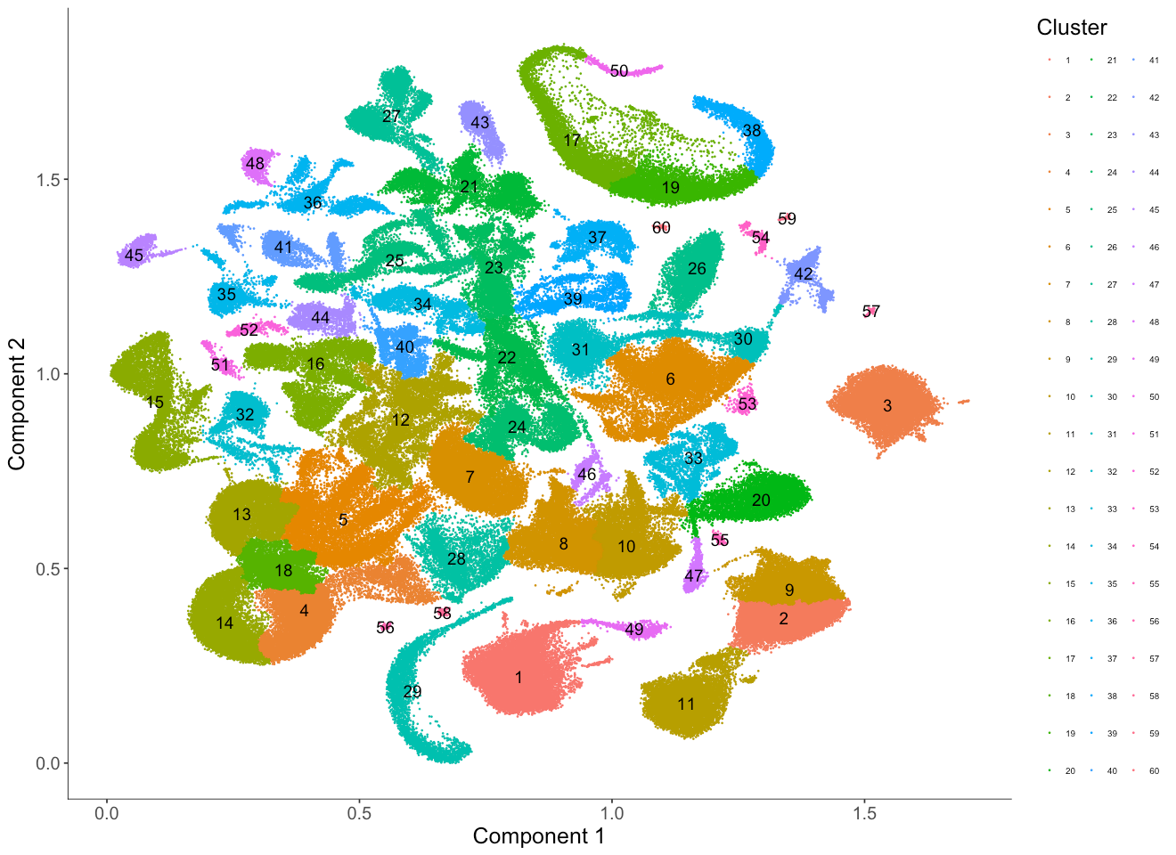
plot_cell_clusters(MCA_cds,
color_by = 'Tissue',
cell_size = 0.1,
show_group_id = T) +
theme(legend.text=element_text(size=6)) + #set the size of the text
theme(legend.position="right") #put the color legend on the right
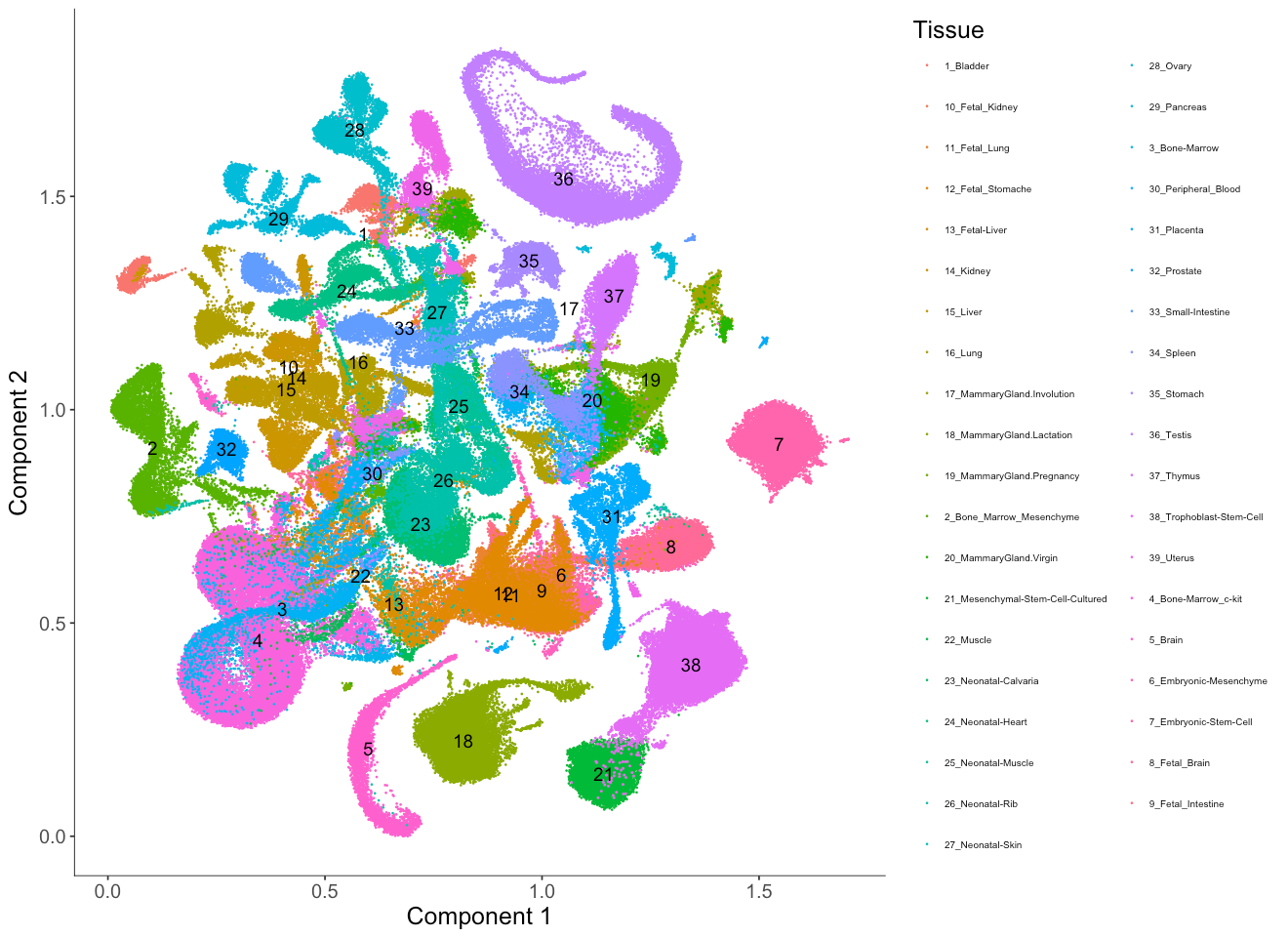
Here we first color the cells by the tissue type annotated from the original study.
Setting show_group_id = T will plot the group ids according to color_by.
If the corresponding group ids are strings, we will assign each group a number and label the number on the embedding while attaching a number to the group ids from the color annotations.
By doing so, we avoid overlaying strings on top of each other on the UMAP embedding.
From the embedding, we can see that UMAP did a great job separating cells from different tissue types and relevant cell types are clustered nearby one another. For example, fetal liver (13) and adult liver (15) are close to each other in the UMAP embedding.
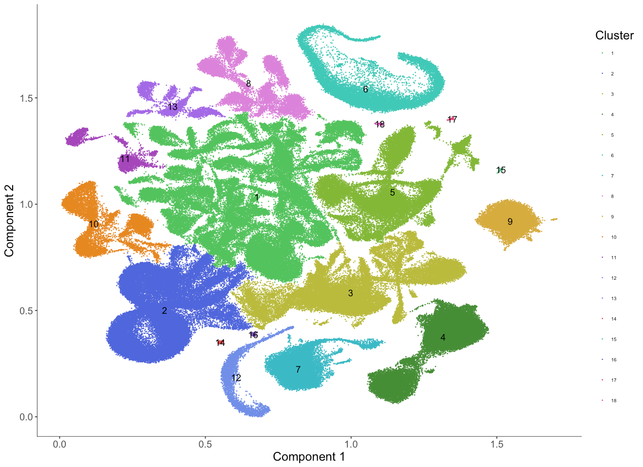
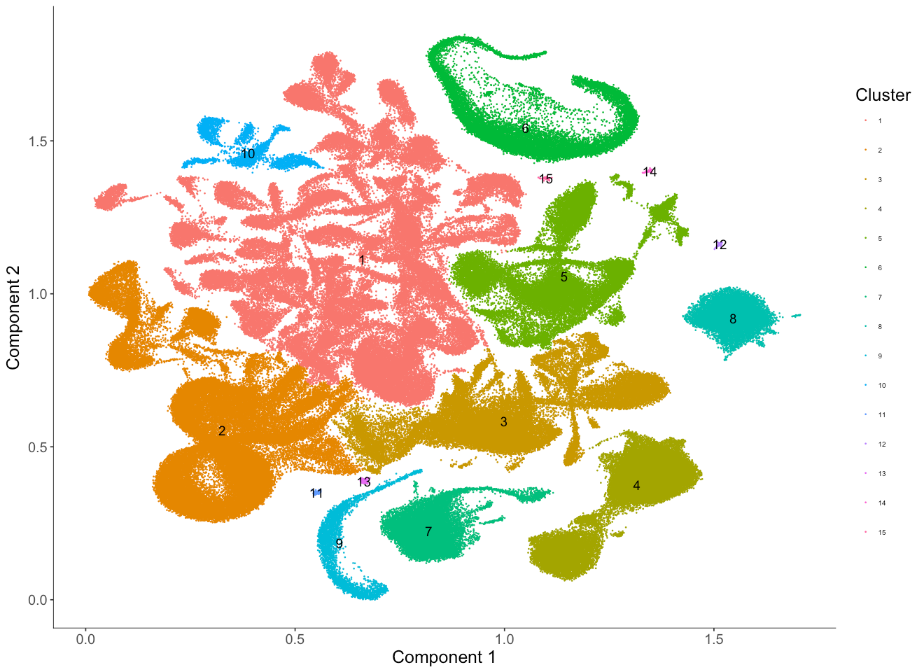
We can also color the cells by the cluster ID identified by the Louvain clustering algorithm.
The cluster IDs are ordered from the largest cluster (in terms of number of cells) to the smallest cluster.
Just by eye we can see that the clustering match well with tissue types from the original study.
However, some clusters, (for example, clusters 1 and 5) appear to consist of multiple subclusters that haven't been broken up by the Louvain algorithm.
We can either increase the res parameter when we run the clusterCells function to identify substructure or we can subset the cds and redo the Louvain clustering again on this subset to get more fine grained clusters.
options(repr.plot.width = 11)
options(repr.plot.height = 8)
cluster_col_vector <-
  col_vector_origin[1:length(unique(as.character(pData(MCA_cds)$Cluster)))]
names(cluster_col_vector) <- unique(as.character(pData(MCA_cds)$Cluster))
plot_cell_clusters(MCA_cds,
                   color_by = 'Cluster',
                   cell_size = 0.1,
                   show_group_id = T) +
    scale_color_manual(values = cluster_col_vector) +
    theme(legend.text=element_text(size=6)) + #set the size of the text
    theme(legend.position="right") #put the color legend on the right
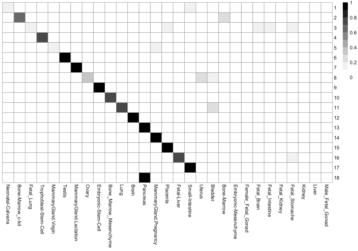
How do clusters break down by tissue?
We can check the percentage of cells in each cluster distributed into each tissue type. This can help us to figure out the identity of each cell cluster.
Cluster_tissue_stat <- table(pData(MCA_cds)[, c('Cluster', 'Tissue')])

Cluster_tissue_stat <- apply(Cluster_tissue_stat, 1, function(x) x / sum(x))

Cluster_tissue_stat_ordered <- t(Cluster_tissue_stat)

options(repr.plot.width=10, repr.plot.height=7)

order_mat <- t(apply(Cluster_tissue_stat_ordered, 1, order))
max_ind_vec <- c()

for(i in 1:nrow(order_mat)) {
  tmp <- max(which(!(order_mat[i, ] %in% max_ind_vec)))
  max_ind_vec <- c(max_ind_vec, order_mat[i, tmp])
}

max_ind_vec <- max_ind_vec[!is.na(max_ind_vec)]

max_ind_vec <- c(max_ind_vec, setdiff(1:ncol(Cluster_tissue_stat),
                                      max_ind_vec))
Cluster_tissue_stat_ordered <-
  Cluster_tissue_stat_ordered[, row.names(Cluster_tissue_stat)[max_ind_vec]]

pheatmap::pheatmap(Cluster_tissue_stat_ordered,
                   cluster_cols = F,
                   cluster_rows = F,
                   color = colorRampPalette(RColorBrewer::brewer.pal(n=9,
                    name='Greys'))(10))
# annotation_row = annotation_row, annotation_colors = annotation_colors
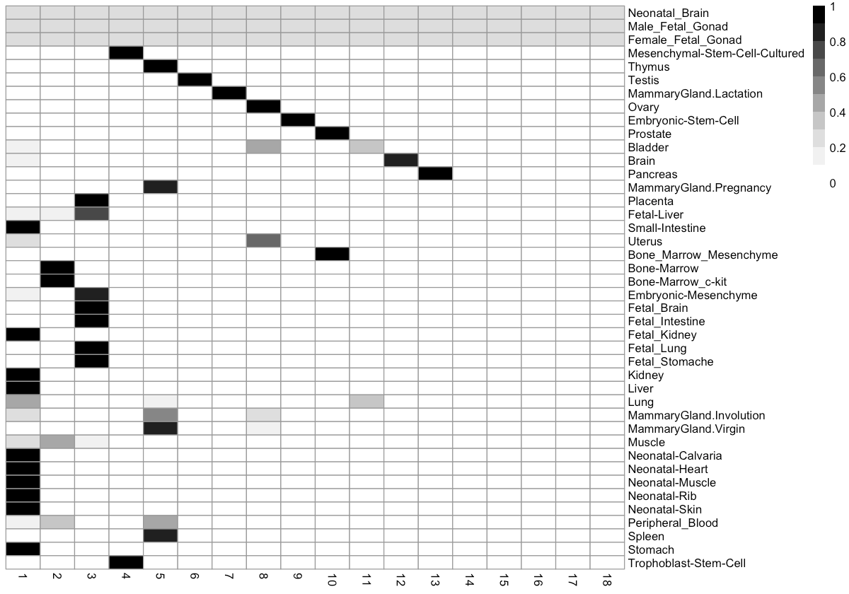
How do tissues break down by cluster?
We can also look at the distribution of tissue types across each cluster. This can help us to figure out how many distinct cell types there are in each tissue.
Cluster_tissue_stat <- table(pData(MCA_cds)[, c('Cluster', 'Tissue')])

Cluster_tissue_stat <- apply(Cluster_tissue_stat, 2, function(x) x / sum(x))

Cluster_tissue_stat_ordered <- t(Cluster_tissue_stat)

options(repr.plot.width=10, repr.plot.height=7)
order_mat <- t(apply(Cluster_tissue_stat_ordered, 2, order))
max_ind_vec <- c()

for(i in 1:nrow(order_mat)) {
  tmp <- max(which(!(order_mat[i, ] %in% max_ind_vec)))
  max_ind_vec <- c(max_ind_vec, order_mat[i, tmp])
}

max_ind_vec <- max_ind_vec[!is.na(max_ind_vec)]

max_ind_vec <- c(max_ind_vec, setdiff(1:ncol(Cluster_tissue_stat), max_ind_vec))
Cluster_tissue_stat_ordered <-
  Cluster_tissue_stat_ordered[colnames(Cluster_tissue_stat)[max_ind_vec], ]

pheatmap::pheatmap(Cluster_tissue_stat_ordered,
                   cluster_cols = F,
                   cluster_rows = F,
                   color = colorRampPalette(RColorBrewer::brewer.pal(n=9,
                      name='Greys'))(10))
# annotation_row = annotation_row, annotation_colors = annotation_colors
How to choose the resolution for louvain clustering
Clustering is more or less like an art. The "right" resolution for clustering depends on your data and on your need during downstream analysis. Here we demonstrate how the resolution parameters from the louvain clustering algorithm can help us to show the granularity of cell clustering structure. The above resolution with 1e-6 works quite well but we will use 2 other different resolutions (5e-5 and 5e-7) to show this effect.
options(repr.plot.width = 11)
options(repr.plot.height = 8)
MCA_cds_res_resolution <- clusterCells(MCA_cds,
                                       use_pca = F,
                                       method = 'louvain',
                                       res = 5e-5,
                                       louvain_iter = 1,
                                       verbose = T)
cluster_col_vector <-
  col_vector_origin[1:length(
    unique(as.character(pData(MCA_cds_res_resolution)$Cluster)))]
names(cluster_col_vector) <-
  unique(as.character(pData(MCA_cds_res_resolution)$Cluster))

plot_cell_clusters(MCA_cds_res_resolution,
                   color_by = 'Cluster',
                   cell_size = 0.1,
                   show_group_id = T) +
  theme(legend.text=element_text(size=6)) + #set the size of the text
  theme(legend.position="right") #put the color legend on the right
We can see cluster 1 in the previous case with resolution 1e-6 is now separated into twelve clusters (12, 16, 22, 23, 24, 34, 37, 39, 40, 41, 44, 52). Similarly, cluster 3 is now separated into eight clusters (8, 10, 20, 28, 33, 46, 47, 55).
options(repr.plot.width = 11)
options(repr.plot.height = 8)
MCA_cds_res_resolution <- clusterCells(MCA_cds,
                                       use_pca = F,
                                       method = 'louvain',
                                       res = 5e-7,
                                       louvain_iter = 1,
                                       verbose = T)
cluster_col_vector <-
  col_vector_origin[1:length(
    unique(as.character(pData(MCA_cds_res_resolution)$Cluster)))]
names(cluster_col_vector) <-
  unique(as.character(pData(MCA_cds_res_resolution)$Cluster))

plot_cell_clusters(MCA_cds_res_resolution,
                   color_by = 'Cluster',
                   cell_size = 0.1,
                   show_group_id = T) +
  theme(legend.text=element_text(size=6)) + #set the size of the text
  theme(legend.position="right") #put the color legend on the right
We can see cluster 1 in this case now includes three clusters from the previous case which specified a resolution of 1e-6 (1, 11, 8). We also observe that cluster 2 in this case is now made up of two clusters from the prior case (2 and 10).
Identify genes that are differentially expressed between clusters
As mentioned in the previous tutorial, we introduced a powerful statistical test to identify genes that vary along a trajectory.
This test, which uses a variant of Moran's I, works by finding genes that vary over a graph that describes the topological relationships between the cells.
This test (implemented in the principalGraphTest function) is very general and can be also applied to identify genes that are differentially expressed between clusters.
Note that since we haven't learned a developmental trajectory for this CellDataSet, Monocle 3 will build a k-nearest-neighbor graph based on the UMAP space as the graph for the Moran's I test.
There are quite a few cells in the dataset, so this test can take a few hours. The running time of this test depends on the k parameter of principalGraphTest.
Like other differential expression function in Monocle, principalGraphTest can use multiple cores, so you may want to run this on a multi-core machine.
start <- Sys.time()
spatial_res <- principalGraphTest(MCA_cds, relative_expr = TRUE, k = 25, cores = detectCores() - 2, verbose = FALSE)
end <- Sys.time()
end - start
Finding cluster-specific marker genes
Often, we wish to find genes that are not only differentially expressed across clusters - we want genes that are expressed only in certain clusters. There are many ways of doing this, but many statistically principled methods are also quite slow, espcially on large datasets. Monocle 3's test for finding genes that vary between clusters, in contrast is both fast and can easily be post-processed to yield genes specific to each cluster.
To categorize genes into cluster specific genes, we simply calculate the specificity of each gene to each cell cluster.
In Monocle 3, we introduce the find_cluster_markers function to find marker genes for each group of cells.
This function measures specificity using the Jensen-Shannon distance, which is often used to identify highly tissue specific genes (Cabili et al, Genome Research).
Genes that have scores close to one for a cluster are highly specific to that cluster.
cluster_marker_res <-
  find_cluster_markers(MCA_cds,
                       spatial_res,
                       group_by = 'Cluster',
                       morans_I_threshold = 0.25)
genes <- (cluster_marker_res %>%
dplyr::filter(mean > 0.5, percentage > 0.1) %>%
dplyr::group_by(Group) %>% dplyr::slice(which.max(specificity)))
options(repr.plot.width=22, repr.plot.height=12)
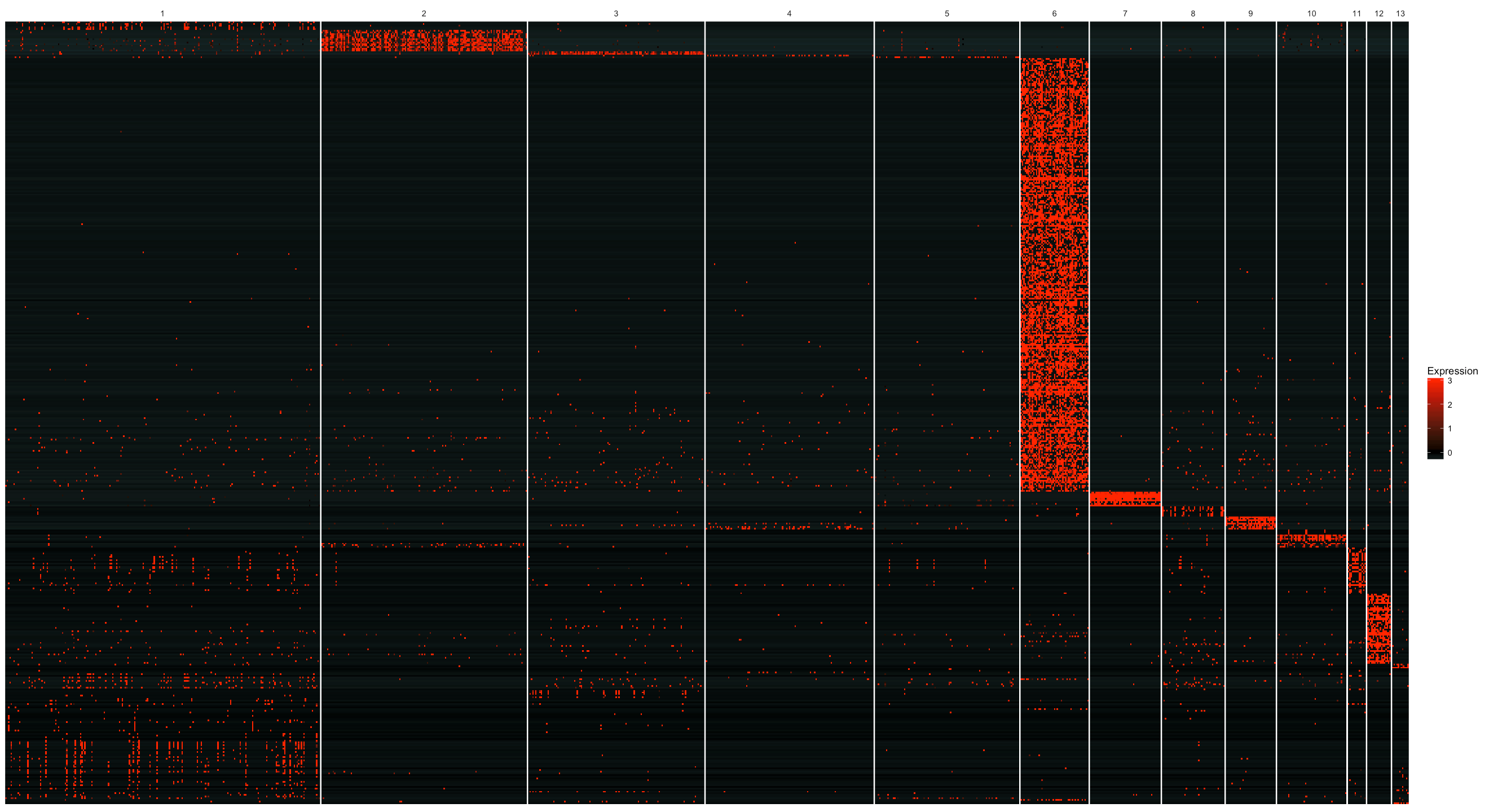
plot_markers_by_group(MCA_cds, genes$gene_short_name, group_by = 'Cluster', ordering_type = 'maximal_on_diag')
Visualizing marker expression across cell clusters
It is often very useful to visualize the marker gene expression pattern across cell clusters to associate each cluster with particular cell types based on the markers.
In Monocle 3, we provide the plot_markers_cluster function to visualize a heatmap of markers across cell clusters.
We first select the top 5 significant genes of the entire set of significant genes based on the principal graph test from each cluster ranked by the specifity score.
Then we feed those genes into the plot_markers_cluster function.
As the single cell RNA-seq datasets get bigger, we cannot visualize all cells.
This argument helps users to visualize the large scale dataset with a uniform downsampling scheme for cells.
By default, if the cell number is larger than 50, 000, we downsample to 1000 cells.
We can also ignore small clusters that is hard to visualize on the heatmap with a minimum fraction of cell number for a cluster to the largest cluster.
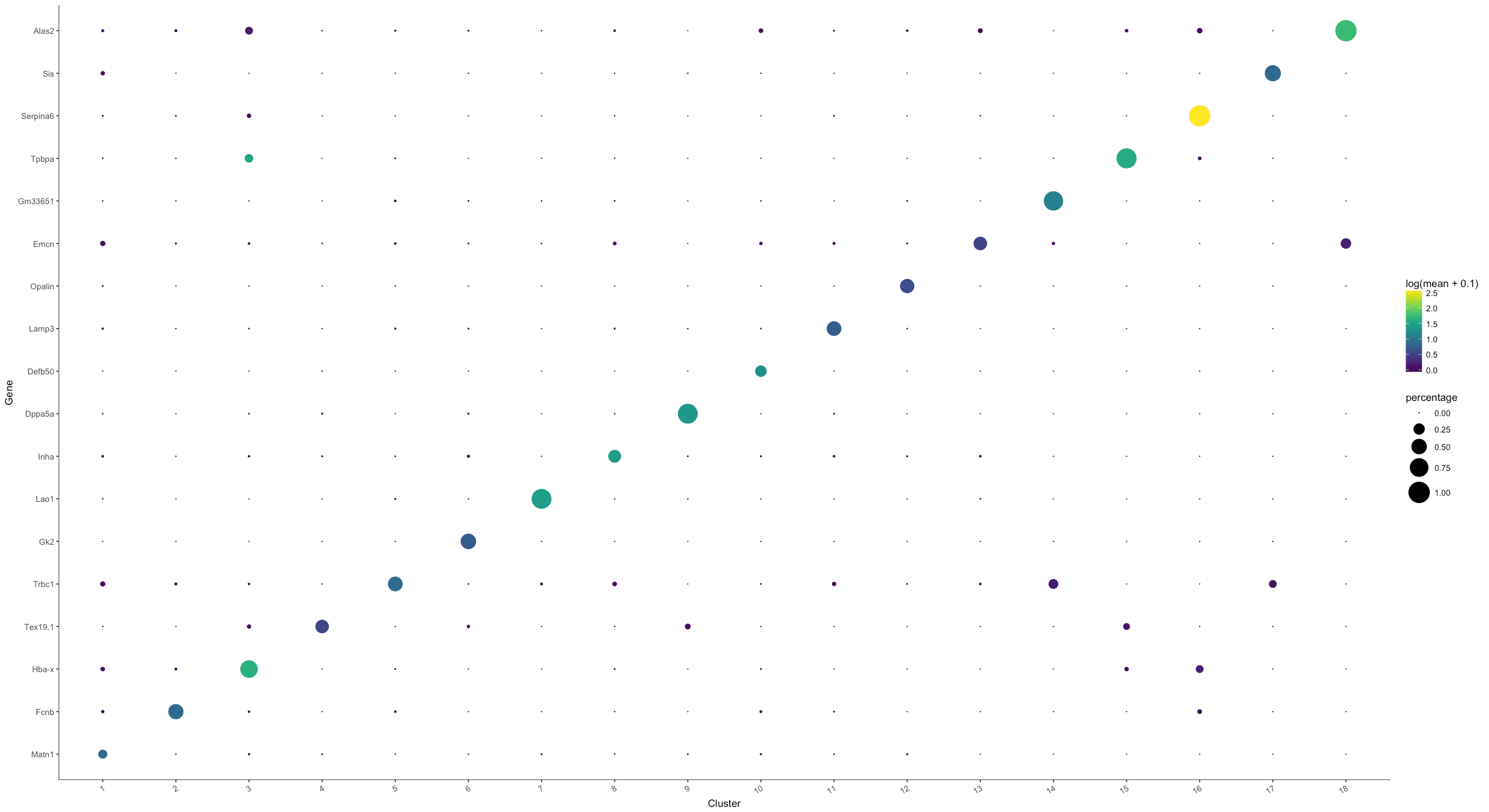
From the figure below, we see that the identified markers genes indeed show strong cluster specificity. We can also see that marker genes for cluster 1 is not very strong, probably reflecting the fact that cluster 1 seems like including a mixture of different types of cells from the UMAP embedding. Similarly, we can also see that cluster 3 seems like contain two groups of genes showing strong specifity. Let us take a look for some genes for cluster 7 (and then for cluster 8).
genes <-
  (cluster_marker_res %>%
  dplyr::filter(mean > 0.5, percentage > 0.1) %>%
  dplyr::group_by(Group) %>%
  dplyr::top_n(5, wt = specificity))
plot_markers_cluster(MCA_cds, as.character(genes$gene_short_name),
                     minimal_cluster_fraction = 0.05)
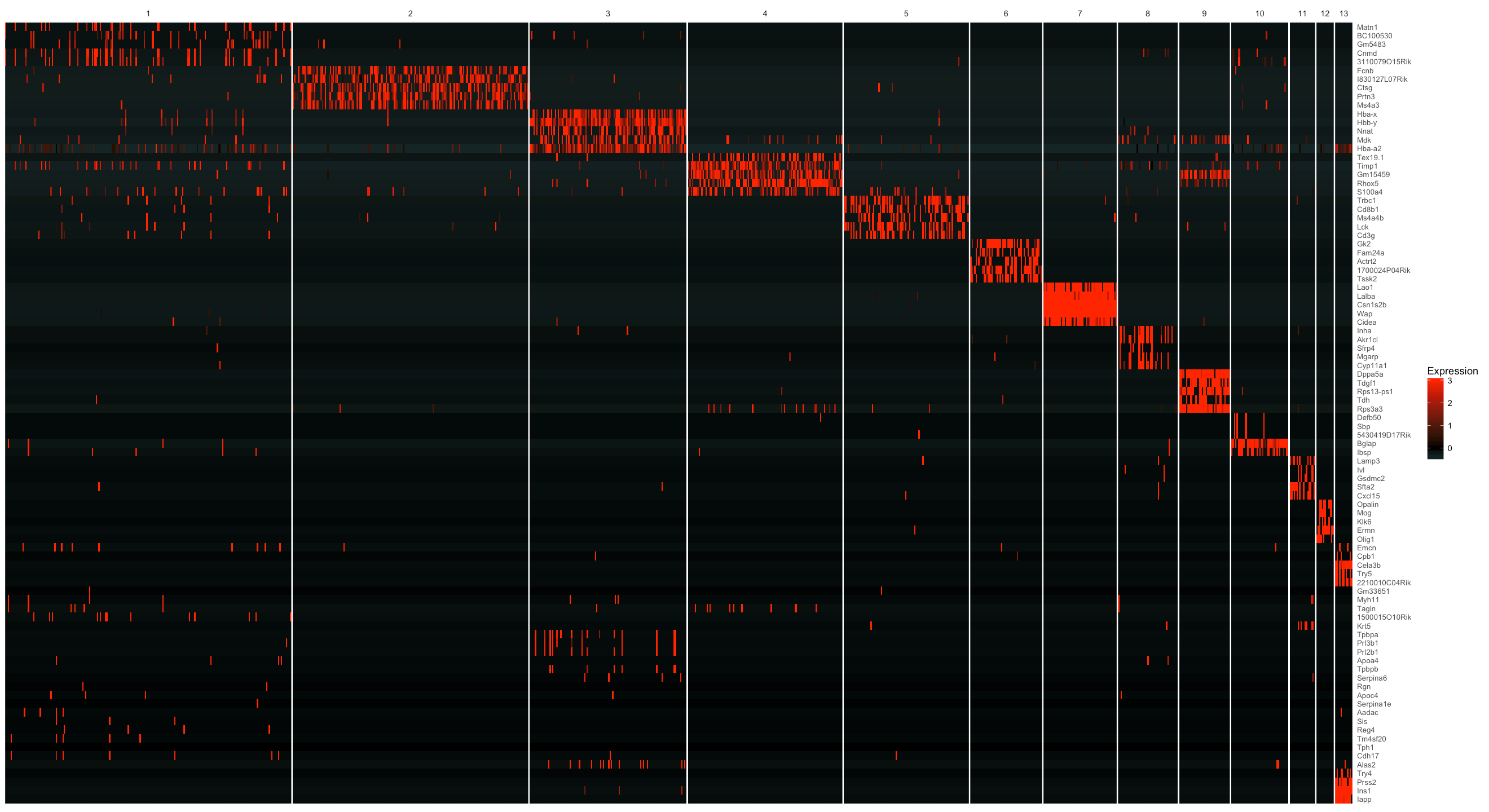
We can also select genes in each group based on a specifity score. By doing this, we are able to see the difference in terms of the number of genes across each cell cluster more clearly. Here we filter genes with a specifity larger than 0.7 and then group the genes by cluster, followed by sorting the specifity score in each cell cluster.
From the figure below, we can see that cluster 6 has a large number of cluster specific genes. From the plot with cell clusters on the umap embedding, we know that cluster 6 are testis genes. Testis are notoriously known for expressing lots of genes that are normally restricted to other cell types. On the other hand, many highly specific genes are expressed in their tissue of origin and but at low levels of testis. So this result makes perfect sense biologically.
options(repr.plot.width=22, repr.plot.height=12)
genes <- cluster_marker_res %>%
         dplyr::filter(mean > 0.5, percentage > 0.1, specificity > 0.7) %>%
         dplyr::group_by(Group) %>%
         dplyr::arrange(Group, dplyr::desc(specificity))
plot_markers_cluster(MCA_cds,
                     as.character(genes$gene_short_name),
                     minimal_cluster_fraction = 0.05,
                     show_rownames = F)
Visualizing marker expression in UMAP plots
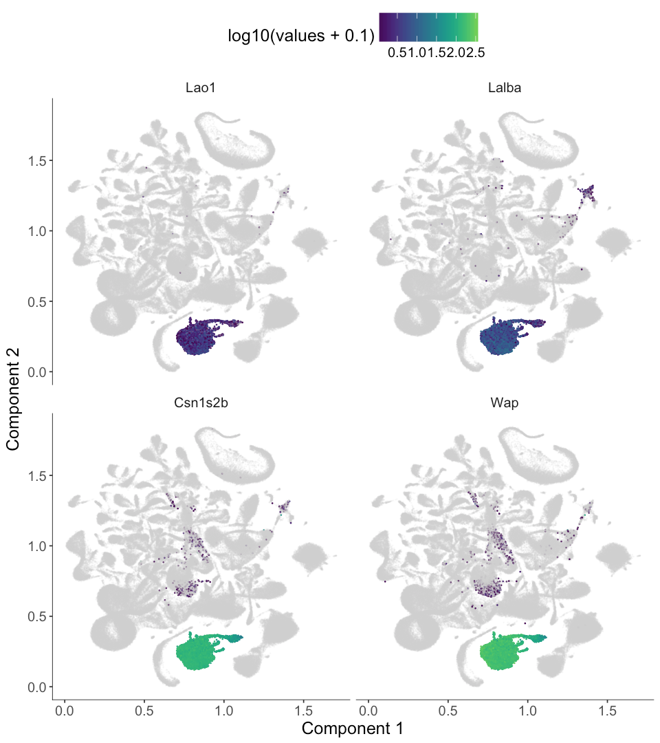
Sometimes it's important to show the expression level for a set of genes in UMAP or t-SNE plots. Let's select a few highly specific genes:
top_4_genes <- genes %>%
               dplyr::filter(Group == 7) %>%
               dplyr::top_n(n = 4, wt  = specificity)
top_4_genes| Group | Gene | gene_short_name | specificity | morans_I | moran_test_statistic | pval | qval | mean | num_cells_expressed_in_group | percentage | status | use_for_ordering |
|---|---|---|---|---|---|---|---|---|---|---|---|---|
| 7 | Lao1 | Lao1 | 0.9795237 | 0.8505168 | 1532.571 | 0 | 0 | 1.422162 | 11564 | 0.8544407 | OK | TRUE |
| 7 | Lalba | Lalba | 0.9502404 | 0.9662100 | 1741.026 | 0 | 0 | 2.240092 | 13324 | 0.9844835 | OK | TRUE |
| 7 | Csn1s2b | Csn1s2b | 0.9422779 | 0.9950623 | 1793.012 | 0 | 0 | 4.832813 | 13534 | 1.0000000 | OK | TRUE |
| 7 | Wap | Wap | 0.9350323 | 0.9932139 | 1789.681 | 0 | 0 | 5.215716 | 13534 | 1.0000000 | OK | TRUE |
Now we can use plot_cell_clusters with the markers argument to render these gene's expression levels. We used a viridis color gradient, so that dark blue means low expression and green means medium expression while yellow means high expression. The gray color means no expression.
options(repr.plot.width = 8)
options(repr.plot.height = 9)
marker_genes <- top_4_genes$Gene
plot_cell_clusters(MCA_cds,
                   markers = as.character(marker_genes),
                   show_group_id = T, cell_size = 0.1)
cluster_marker_res %>%
  dplyr::filter(gene_short_name %in% c('Csn3', 'Csn1s1'), Group == 7)
options(repr.plot.width = 8)
options(repr.plot.height = 5.5)
plot_cell_clusters(MCA_cds,
                   markers = c('Csn3', 'Csn1s1'),
show_group_id = T, cell_size = 0.1)| Group | Gene | gene_short_name | specificity | morans_I | moran_test_statistic | pval | qval | mean | num_cells_expressed_in_group | percentage | status | use_for_ordering |
|---|---|---|---|---|---|---|---|---|---|---|---|---|
| 7 | Csn1s1 | Csn1s1 | 0.7045754 | 0.9758849 | 1758.448 | 0 | 0 | 4.675093 | 13534 | 1 | OK | TRUE |
| 7 | Csn3 | Csn3 | 0.6974297 | 0.9701249 | 1748.067 | 0 | 0 | 4.665920 | 13534 | 1 | OK | TRUE |
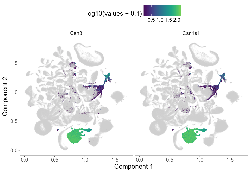
We see that genes from the second group of genes doesn't seem to be very specific to cluster 7 as the cluster_marker_res table shows that this gene has only about 0.7 specificity. From the umap embedding, we see it is actually also expressed in cluster 1 and cluster 5 at low expression level.
Citation
Monocle 3 will be described in upcoming publications from the Trapnell lab. Monocle 3 draws on ideas from others as we have noted in this page, but many of the features in Monocle 3 are novel work. In particular, the use of Moran's I for single-cell RNA-seq, learning a principal graph to fit within UMAP-reduced cells, and the combination of approximate graph abstraction and reversed graph embedding are all novel ideas to the best of our knowledge. We would be very grateful for an acknowledgement that these ideas first appeared in Monocle if you use similar approaches in your own work. If you use Monocle to analyze your experiments, please cite:citation("monocle")
## Cole Trapnell and Davide Cacchiarelli et al (2014): The dynamics
## and regulators of cell fate decisions are revealed by
## pseudo-temporal ordering of single cells. Nature Biotechnology
##
## Xiaojie Qiu, Andrew Hill, Cole Trapnell et al (2017):
## Single-cell mRNA quantification and differential analysis with
## Census. Nature Methods
##
## Xiaojie Qiu, Cole Trapnell et al (2017): Reverse graph embedding
## resolves complex single-cell developmental trajectories. BioRxiv
##
## To see these entries in BibTeX format, use 'print(<citation>,
## bibtex=TRUE)', 'toBibtex(.)', or set
## 'options(citation.bibtex.max= 999)'.